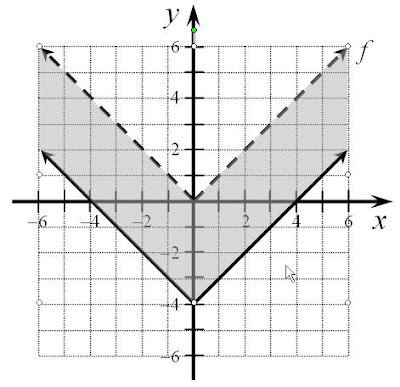
One of my assistants requested advice about creating an inequality graph (with grey shading) using PowerPoint, so I thought I might as well share it here too.

The trick is to use a Freeform drawing object, and then send the shading to the back of the diagram using the “order” feature.

The trick is to use a Freeform drawing object, and then send the shading to the back of the diagram using the “order” feature.
You can see it (a short Jing) here.
There’s an older post (and longer video) about creating a very detailed graph with a break on one of the axes using PowerPoint. This is, of course, not the intended use of PowerPoint, but it is software that “talks to Word” nicely and can create truly lovely printable graphs.

