I’ve been spending the first 5-10 minutes of every 2-hour math class discussing graphs in the news with my students. I’ll give you a few examples of what came up naturally week by week:
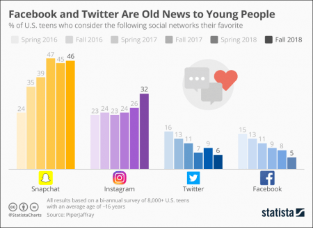
- Lots of social media graphs: Slope of the adoption rates for new users, the DAU (daily active users) and MAU (monthly active users) over time, and comparison of the adoption of new features in different platforms (Snapchat, Facebook, Instagram, and Twitter)
- Tech industry: Growth of Amazon, Facebook, and Google, rise in employees at these companies, and comparison the money spent on Black Friday in the U.S. to the amount spent on Singles Day in China
- Science: Money spent on the space industry over time, periodic nature of radiation on mars, distance of the ISS above the surface of the earth (over time), percent of people with HIV who receive drug treatment in the world, and all sorts of numbers and graphs about plastic
- Game industry: VR game adoption rates, Fortnite, Fortnite compared to (fill in the blank) game
Okay that is just a small sampling. If it’s in the news, and it’s a graph I’ve seen, we talk about it. I think that graphs (especially those that chart trends over time) give a much more realistic sense of what is going on than the small news blurbs and social media outrages that pop up in the moment. When you see the whole trend over many years or comparisons of one item with like items, it gives the reader a different context in which to frame the data. Plus, for many of my students, this seems to be the only time they actually discuss anything from the week of news (as most of it is a surprise to all but a few students).
With each graph, I try to prod the class to think critically:
- What does the graph mean?
- Are there any inconsistencies on the axes? (large jumps in years, for example)
- What questions do you have now that you’ve seen this graph?
- What bothers you about the graph?
- What would you want to see added to the graph?
And then many times we go find extra information based on the suggestions and questions from the class.
The students each semester seem to enjoy “Graphs Time” in class, so a few weeks ago I asked my students how they were going to keep up with graphs after the term was over. One of them said “Aren’t you going to keep sending us graphs?” (with a smile) and I thought … huh. So first I tried to get them to sign up for an excellent Chart of the Day email newsletter from Statista. There was almost no reaction. I had one taker.
During our 5-minute break, I reflected on something that I myself had said during a social media workshop at a conference recently. If you want to reach today’s traditional-age students, you’ve got two choices: Snapchat and Instagram. So after the break I pointed the students to the Statista Instagram account. Ahh progress. Now 10 students turned on their phones to sign up.

Unfortunately, I realized after class that the Statista Instagram account does not actually post graphs (mostly photos). So disappointing. But then I realized that I actually find the graphs in all sorts of places. My weekly reading includes all sorts of traditional, digital, and social media that post graphs as part of their normal offerings. This is when I decided that this “sharing of the graphs” is important to me. It is vital that students learn about the trends in the world, learn to see the long game, the history of the world, the context of comparisons. This is one small thing I can do to help create more well-informed citizens. I’m collecting the graphs anyways, I might as well share them.

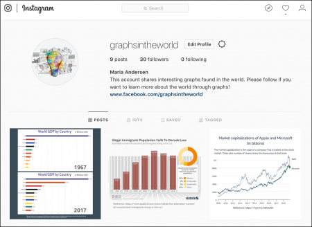
So, I decided to start an Instagram graphsintheworld account (for the young’uns) and a Facebook Graphs In the World page (for us older readers). Since I collect about 1-3 graphs a day, it should provide a way to rack up graphs for your classes, assignments, and discussions as well. This is not just for math folks. There are plenty of graphs in here with social and business implications. I am surprised by at least one graph every week that teaches me something I did not know.
Please consider following a Graphs In the World account and inviting your colleagues and students (and friends and spouses) to follow as well. Then you too can be the annoying person in every conversation that says “Hold on a moment, I think I have a graph about this.”


