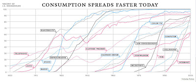
This great graphic is from the New York Times (2/10/08) article entitled “You are what you spend” on the spread of consumption of a variety of consumer goods. A link to the two graphics in the article can be found here. There is a second graphic about what we spend vs. what we earn broken up by the lower fifth of earners, middle fifth, and highest fifth of salaries per household.
 You will, of course, recognize the great logistic curves here. Not sure how long the links will last – often newspapers will pull down their content after a few weeks, so save the resources if you want them.


