In a previous post called Starting from Scratch (Part I), I mentioned that I think it’s a mistake to design an online course around the schedule. I received several questions via email asking me to elaborate on why I think it’s a mistake to do schedule-driven design, so here we go…
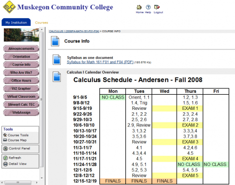
First, let me be very clear that I do have a schedule for every course. I just don’t design the course around the schedule. If a student wants to see when an assignment is due or when a test will be, they can, in one click, view the schedule for the course. However, as far as the design goes, the schedule is almost always the very last thing I create. What keeps students on track in the online course is the due dates for online homework and the test dates. As they become motivated to complete the assignments and learning tasks, they go diving in to the learning materials.

Many instructional designers and eLearning professionals will tell you that “best practice” for online course is to design the course around the activities and content for each week – making the “week” the unit of instructional design. Let’s me see if I can explain why I think this is problematic.
1. Schedule-driven design makes it difficult for students to find learning materials. Suppose you’re a student, and it’s roughly the middle of the semester, and you’re studying for an exam. You know there are few topics you need to go back and look at, and you know that the material is available somewhere in your online course. Here’s what you see when you log in to view the course materials:
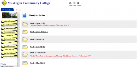

Are those screens helpful to you? Do they immediately direct you to the content that you’re interested in? Do they reinforce your knowledge of the vocabulary that’s used?
Designing around the “week” may even give the mistaken impression idea that learning takes place at a particular time, and once you’re past that time, you should be done with that learning. Schedule-driven design implies that learning is complete when the week is over, while real learning takes place whenever we become engaged and interested. At the moment when a student becomes engaged and interested, it should be easy to find the appropriate learning materials.
2. Schedule-driven design makes it difficult for instructors to place learning materials. Now suppose you’re the instructor. One of your colleagues has just sent you an awesome YouTube video that you know would be the perfect addition to your online course. So you log into the course in order to find the appropriate place to put this video. Here’s what you see:


Was that helpful to you? Could you immediately determine the proper location to insert that video in the course? Again, the structure of the schedule-driven design has gotten in the way. As you find new learning material to enhance your online course, it should be easy to locate the proper place to put it.
Look at these screenshots instead, from a course designed around the content instead of the schedule:
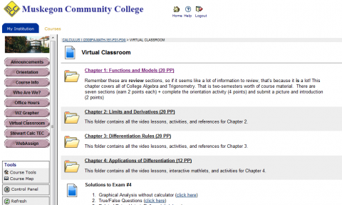

Do you see the difference?
3. You should not have to redesign everything when the course format or schedule changes. Suppose you spend gobs of time carefully designing an online course to run in a 15-week semester using a schedule driven design concept. This is all well and good until somebody informs you that you’ll be teaching a 10-week hybrid version of this course in the next semester. Guess what? You’re now going to have to redesign the entire digital platform around that new schedule and format. That really seems like a waste of time that could be better spent designing good learning experiences. If only you had designed around the content, all you would have to do is think about ways to change the assessment and engagement for a hybrid format, and set a new course pace in a separate schedule.
4. Learning should be flexible within the semester. When the course design is schedule-driven, it becomes difficult to make course corrections during the semester. With a content-designed format, if we need to spend a little more time on a topic, I don’t have to worry that my whole course designers will be thrown off by that. I can make a simple adjustment in a one-page schedule or make an announcement that we’re altering course slightly. However, the online course environment has not changed in the least bit.
5. Online course design should emphasize learning vocabulary. We give lots of lip-service to improving our students’ communication skills and encouraging them to read and practice with vocabulary. And then what do we do? We design courses around folders called “Week 1,Week 2, Week 3…” I design courses around folders with names like “Functions and Models, Limits and Derivatives, Differentiation Rules,…” Inside these folders are more detailed, concept-oriented folders that say things like “Tangent and Velocity Problems” and “The Limit of a Function.” As students navigate through the course and go back to relearn something they didn’t quite catch the first time, the course structure emphasizes vocabulary. Not only that, it helps students to form a “big picture” structure of how topics fit together as they navigate the course structure. Would you rather have students understand that velocity is part of understanding derivatives, or have students that understand that velocity was something that they learned in week three?
6. Online course design should make it easy to continue to add new materials. It is much easier to continue to add layers of material to a digital course platform if it’s easy to find learning objectives for the course. I never have to redesign the course simply because it runs in a different format or different number of weeks. My face-to-face course shell, my hybrid course shell, and my online course shell all look exactly the same from a design standpoint. The assignments for the students and the assessment of the students might vary slightly depending on the course format, but this is simply a layer sits on top of the course design. With each semester, the digital course platform becomes a richer place for the students to explore and learn. Every semester I add more content: website references, clever YouTube videos, videos that I record in class, videos that students record and are willing to share, games that help teach particular learning concepts, etc. If I were designing around the schedule, then I would spend a great deal of time every year rearranging the course to fit within the specific weeks, holidays, and format, instead of spending that time finding valuable material that might help my students learn better.
7. Online course design should facilitate use for instructional reference. I use the digital course platform course shell as a reference for my own teaching. Five years ago, I had a system of binders that contained lecture notes, group activities, worksheets, etc. Before each class I would consult the binder to see what materials and notes I had available to use in class. Today I consult the course shell. The one-page schedule tells me roughly what I need to cover to stay on track for the semester, but I dive into the “Virtual Classroom” of materials to see what I have available to me in my toolkit for class. The Virtual Classroom is an index of all the learning materials I’ve found over the last several years. I won’t use all of it, but it allows me to be really flexible with what we do in class. I can constantly assess how well the students are learning, and then adjust based on that assessment. If we don’t “cover” something in class, I know it’s available to students in the digital materials and that they can access it later. If a student asks a question, and I’ve found an interactive demonstration that would help answer the question, I know exactly where to find it. If a group of students comes up with a really clever way to explain a concept, I can ask them if they’re willing to record it and then add it to the course shell after class, sharing their wisdom with all of the successive students that follow them.
I used to have digital courses designed around the schedule. But all of those courses have become obsolete as schedules and formats changed, and every single one of them has been deleted from my archive for lack of use. The digital courses I design today are designed around content and learning. I am always on the lookout for new materials to add to the courses and every semester, the learning materials are better than the semester before. All I require to get ready for a new semester is a copy of the digital materials from the previous semester, and a new 1-page schedule.


